↓
↓
↓
-
↓
↓
↓
-
Kahlo
Spiced Academy
UX UI Design Course
Final Project
Roles
UX Research, UI Design, Graphic Design, Art Direction, Motion
At Spiced Academy in Berlin, our final project as a team of three, involved designing an app using comprehensive UX/UI principles. From ideation and research to design and final presentation, we applied a full range of skills. In this case study, I will walk through the key decisions and thought processes behind the project.
Art can inspire and provoke, yet many museum and gallery visitors lack the context needed for a deeper appreciation. Often, institutions are unable to provide the detailed information that could enhance the visitor experience.
Kahlo bridges this gap by offering an app that provides insightful guidance and context for artworks in exhibitions. It also keeps users informed about current and upcoming exhibitions in nearby museums and galleries.
By deepening engagement with art and enabling social media sharing, Kahlo transforms the traditional museum visit into a more immersive and
meaningful experience.
Hypothesis
If visitors can use a service that provides more context and explanation about presented art,
it will encourage more visitors to come.
Research
We decided to conduct research through
interviewing friends of ours who qualify as ‘casual museum goers’
interviewing relevant experts
engaging in guerrilla interviews with museum goers on location
The results challenged our hypothesis, revealing that people often choose to engage with art directly, without relying on additional tools for interpretation. This preference appears to be a deliberate choice, rather than a result of limited options.
Nevertheless, we made some valuable discoveries that led us to our User Story and HMW’s.
HMW
Problem:
Museum & gallery visitors don't get the full intellectual experience in a museum/gallery.
How might we Expand/enhance the visitor experience in a museum/gallery?
User Story
As a museum visitor
I want to understand the art that I’m seeing
So that I can have a more meaningful experience.
Design Principles
Our goal was to create a simple user-centred design that offers main stage to the artwork and straightforward navigation that compliments the subject matter.
Accessibility
Simplicity
Bauhaus
Minimalism
Sharp Corners
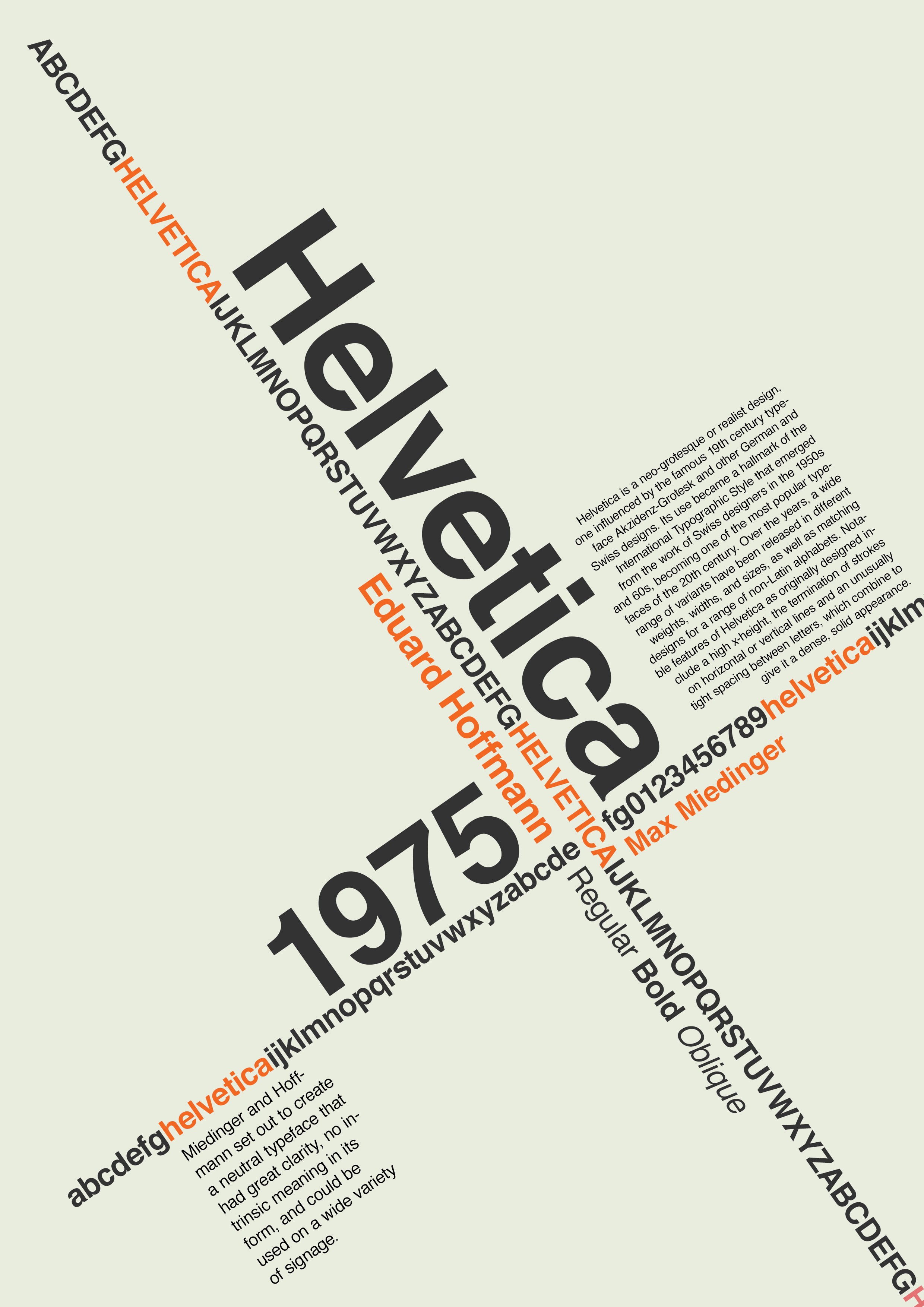
Swiss Design
Design
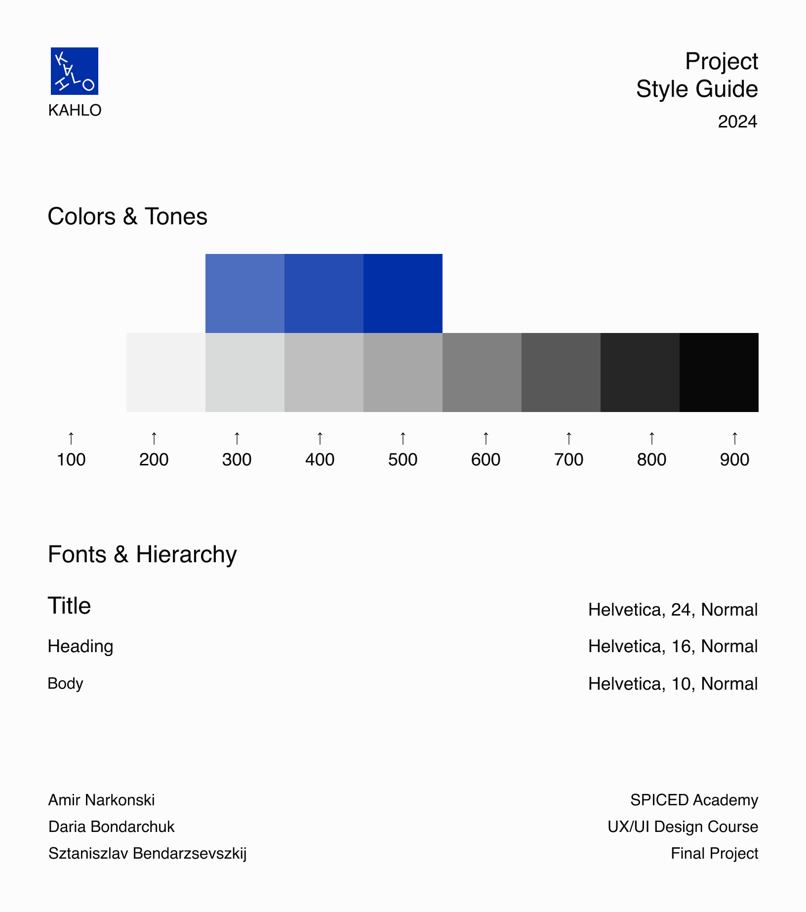
Following our style guide and design principles that we decided on, and taking inspiration from Bauhaus design, we wanted to create a minimal design that did not change much from the low-fi to mid-fi wireframes. We aimed to provide space for the artwork and complement it with extras to allow the user to get informed without too much distraction from the artwork.
Home Screen
We aimed to design our home screen for easy, efficient access to key features with minimal steps. Drawing inspiration from Oatly’s ‘Hey Barista’ app, we chose to implement a similar vertical navigation menu. This layout allowed us to dedicate most of the screen space to showcasing art and exhibitions. The displayed exhibitions are tailored to the user’s location, featuring those from the nearest museum or gallery.
Artwork Page
In order to answer our HMW, we came up with four toggles that provide different information in different mediums and approaches.
Description
Providing users with additional details about the artwork, beyond the basic information like dates and names, which is typically all that museums offer.
Related
This idea was inspired by an interview with an art mediator. They suggested including a section that showcases other art pieces from different time periods or artists to give users a broader context and a deeper understanding of the artwork’s history.
Audio
Instead of a traditional audio guide, this feature offers a music piece that connects to the artwork, allowing visitors to experience the art through sound and enhance their emotional connection to it.
Notes
A section featuring insights from the curator or artist, along with thought-provoking questions designed to spark conversations between visitors.
Testing & Future Improvements
Unfortunately, due to the tight schedule and the nature of a bootcamp final project, minimal testing was conducted before submitting the final product.
However, we performed several user tests post-graduation and identified a few tweaks and changes that could enhance the app's user-friendliness without compromising our unique design.
Proposed Improvements:
Home
Align heading with dynamic island
Ensure location name button leads to Locations page
Align 'Allow Access' prompt with left side on grey background
Location Screen
Correct back button to lead to main page instead of Favorites
Implement dark mode functionality
Artwork Screen
Add artist name to headline
Camera Tool
Add back button
Fix back arrow functionality
Include artist name
My Visits
Remove search bar
My Favorites
Consider black background for dark mode to improve visibility of white heading
Address white stroke above tab bar in share option
These modifications aim to improve user experience and address minor inconsistencies in the app's navigation and design.


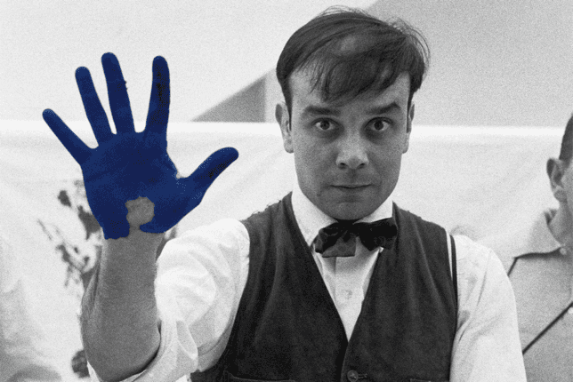
International Klein Blue (IKB)
Hex: #002FA7


International Klein Blue (IKB)
Hex: #002FA7
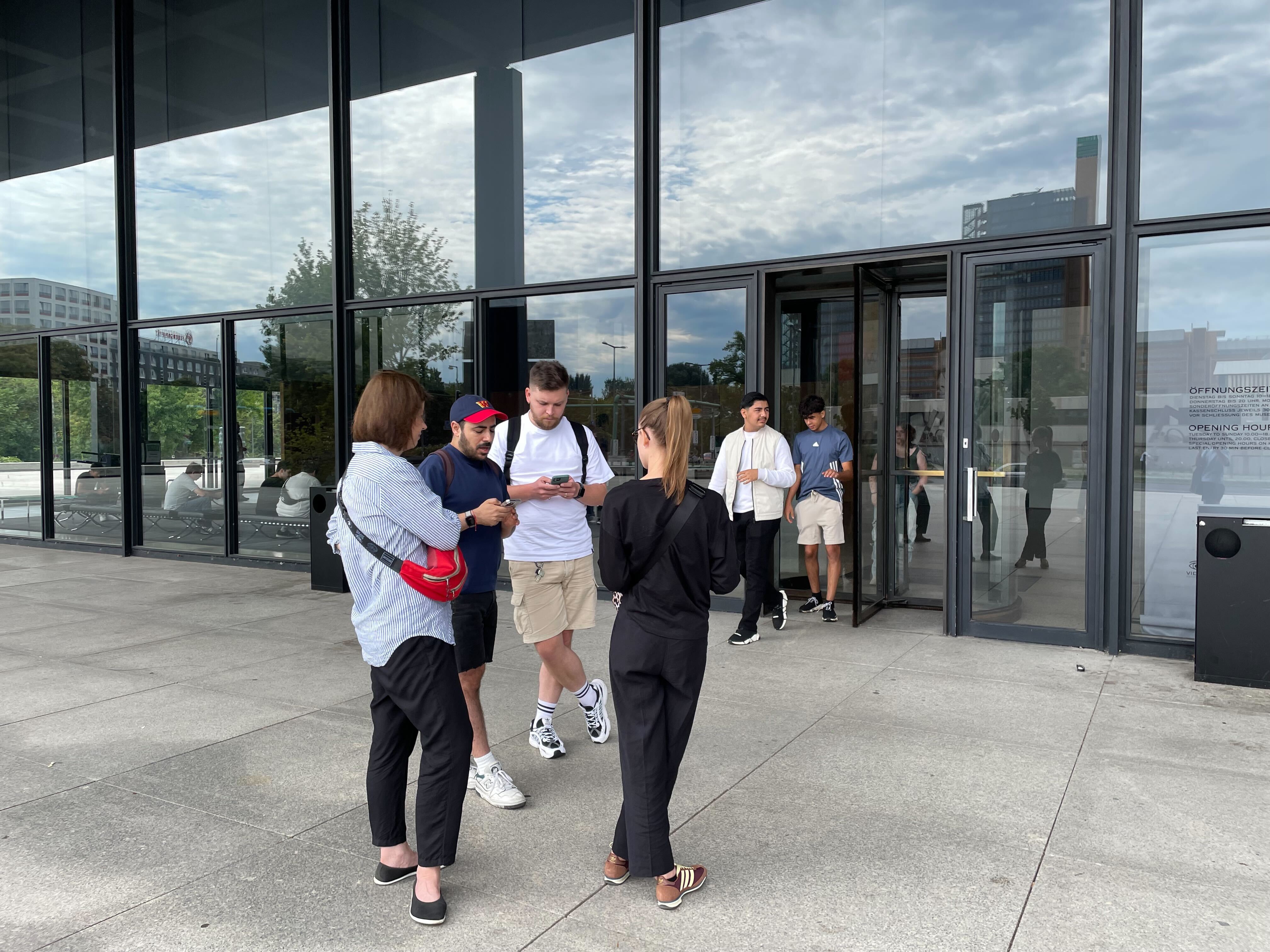
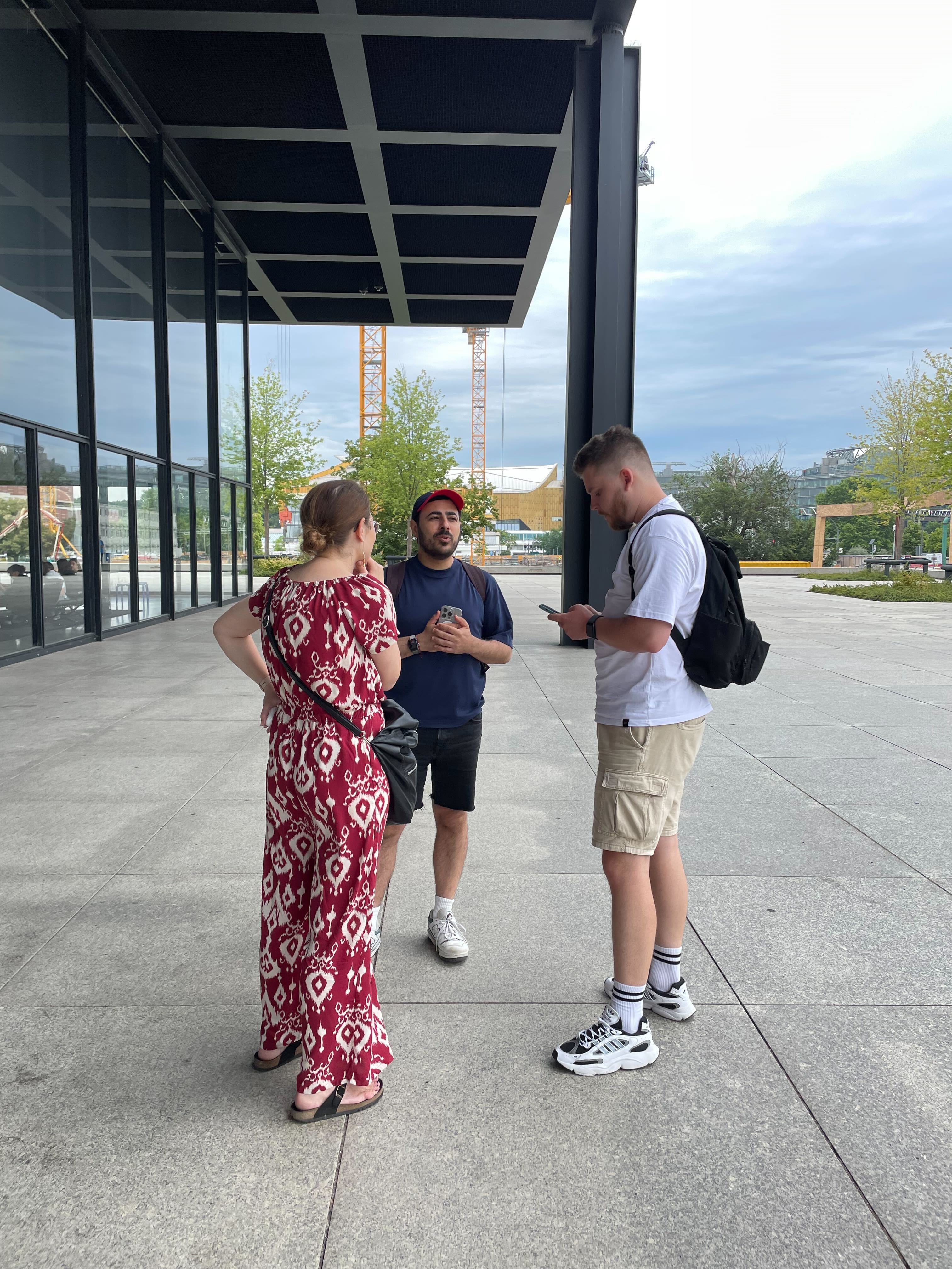
Conducting Guerrilla Interviews
Location: Neue Nationalgalerie (Berlin)


Conducting Guerrilla Interviews
Location: Neue Nationalgalerie (Berlin)
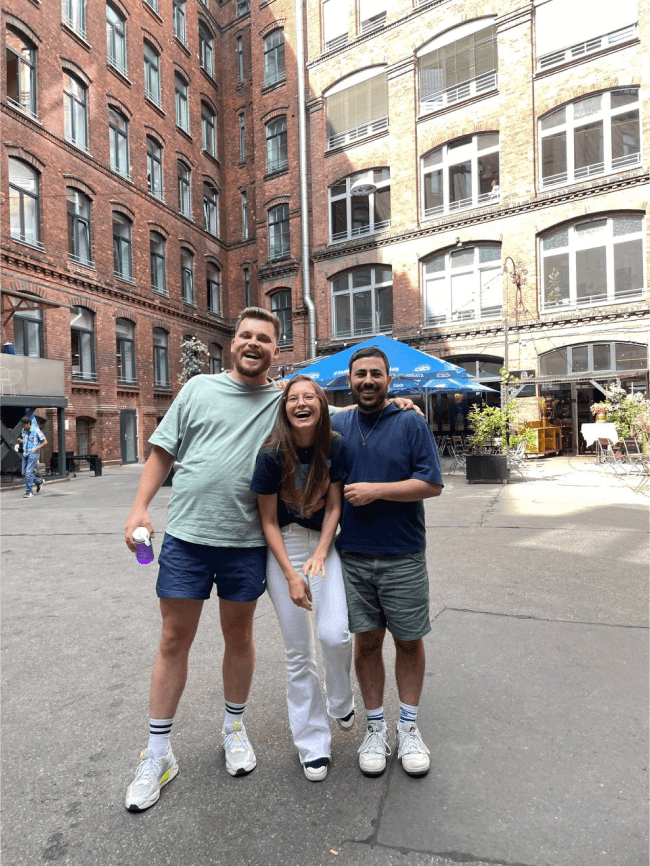
My team at Spiced Academy
Left to Right: Me, Daria Bondarchuk, Amir Narkonski


My team at Spiced Academy
Left to Right: Me, Daria Bondarchuk, Amir Narkonski
-
↓
↓
↓
-
↓
↓
↓
-


Conducting Guerrilla Interviews
Location: Neue Nationalgalerie (Berlin)


My team at Spiced Academy
Left to Right: Me, Daria Bondarchuk, Amir Narkonski


International Klein Blue (IKB) Hex: #002FA7


Kahlo
Spiced Academy
UX UI Design Course
Final Project
Roles
UX Research, UI Design, Graphic Design, Art Direction, Motion
At Spiced Academy in Berlin, our final project as a team of three, involved designing an app using comprehensive UX/UI principles. From ideation and research to design and final presentation, we applied a full range of skills. In this case study, I will walk through the key decisions and thought processes behind the project.
Art can inspire and provoke, yet many museum and gallery visitors lack the context needed for a deeper appreciation. Often, institutions are unable to provide the detailed information that could enhance the visitor experience.
Kahlo bridges this gap by offering an app that provides insightful guidance and context for artworks in exhibitions. It also keeps users informed about current and upcoming exhibitions in nearby museums and galleries.
By deepening engagement with art and enabling social media sharing, Kahlo transforms the traditional museum visit into a more immersive and
meaningful experience.
Hypothesis
If visitors can use a service that provides more context and explanation about presented art,
it will encourage more visitors to come.
Research
We decided to conduct research through interviewing friends of ours who qualify as ‘casual museum goers’
interviewing relevant experts
engaging in guerrilla interviews with museum goers on location
The results challenged our hypothesis, revealing that people often choose to engage with art directly, without relying on additional tools for interpretation. This preference appears to be a deliberate choice, rather than a result of limited options.
Nevertheless, we made some valuable discoveries that led us to our User Story and HMW’s.
HMW
Problem:
Museum & gallery visitors don't get the full intellectual experience in a museum/gallery.
How might we Expand/enhance the visitor experience in a museum/gallery?
User Story
As a museum visitor
I want to understand the art that I’m seeing
So that I can have a more meaningful experience.
Design Principles
Our goal was to create a simple user-centred design that offers main stage to the artwork and straightforward navigation that compliments the subject matter.
Accessibility
Simplicity
Bauhaus
Minimalism
Sharp Corners
Swiss Design
Design
Following our style guide and design principles that we decided on, and taking inspiration from Bauhaus design, we wanted to create a minimal design that did not change much from the low-fi to mid-fi wireframes. We aimed to provide space for the artwork and complement it with extras to allow the user to get informed without too much distraction from the artwork.
Home Screen
We aimed to design our home screen for easy, efficient access to key features with minimal steps. Drawing inspiration from Oatly’s ‘Hey Barista’ app, we chose to implement a similar vertical navigation menu. This layout allowed us to dedicate most of the screen space to showcasing art and exhibitions. The displayed exhibitions are tailored to the user’s location, featuring those from the nearest museum or gallery.
Artwork Page
In order to answer our HMW, we came up with four toggles that provide different information in different mediums and approaches.
Description
Providing users with additional details about the artwork, beyond the basic information like dates and names, which is typically all that museums offer.
Related
This idea was inspired by an interview with an art mediator. They suggested including a section that showcases other art pieces from different time periods or artists to give users a broader context and a deeper understanding of the artwork’s history.
Audio
Instead of a traditional audio guide, this feature offers a music piece that connects to the artwork, allowing visitors to experience the art through sound and enhance their emotional connection to it.
Notes
A section featuring insights from the curator or artist, along with thought-provoking questions designed to spark conversations between visitors.
Testing & Future Improvements
Unfortunately, due to the tight schedule and the nature of a bootcamp final project, minimal testing was conducted before submitting the final product.
However, we performed several user tests post-graduation and identified a few tweaks and changes that could enhance the app's user-friendliness without compromising our unique design.
Proposed Improvements:
Home
Align heading with dynamic island
Ensure location name button leads to Locations page
Align 'Allow Access' prompt with left side on grey background
Location Screen
Correct back button to lead to main page instead of Favorites
Implement dark mode functionality
Artwork Screen
Add artist name to headline
Camera Tool
Add back button
Fix back arrow functionality
Include artist name
My Visits
Remove search bar
My Favorites
Consider black background for dark mode to improve visibility of white heading
Address white stroke above tab bar in share option
These modifications aim to improve user experience and address minor inconsistencies in the app's navigation and design.