↓
↓
↓
-
↓
↓
↓
-
Flavor Fusion
Spiced Academy
UX UI Design Course
Roles
UX/UI Design, Graphic Design, Art Direction, Prompt engineering
FlavorFusion emerged from one of my UX/UI course projects, where the goal was to design a landing page for a recipe search app or website. A key requirement was to integrate AI tools throughout the design process to streamline each stage, enabling the creation of a high-fidelity prototype more efficiently. This approach minimized the use of placeholder content like dummy text or stock images, enhancing the authenticity and polish of the final design.
Brief
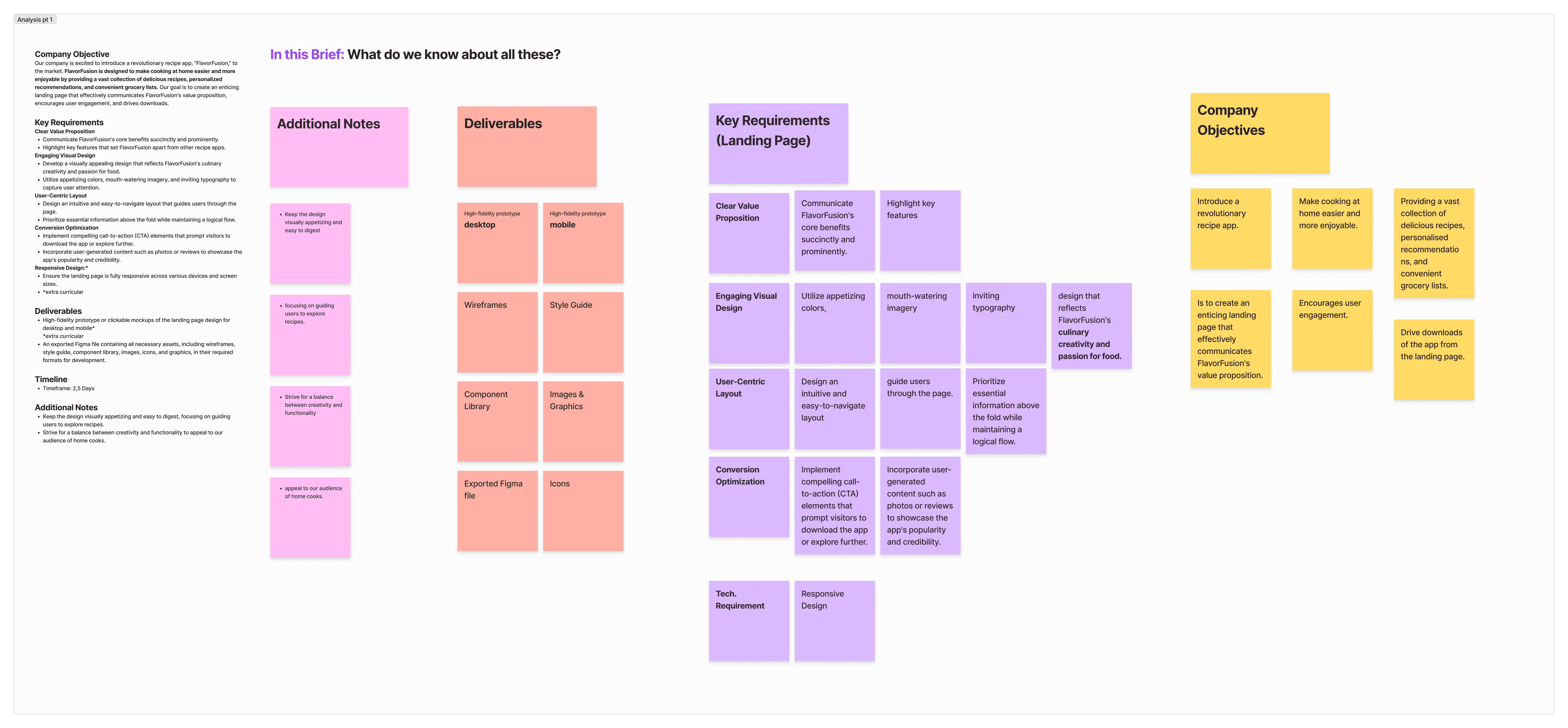
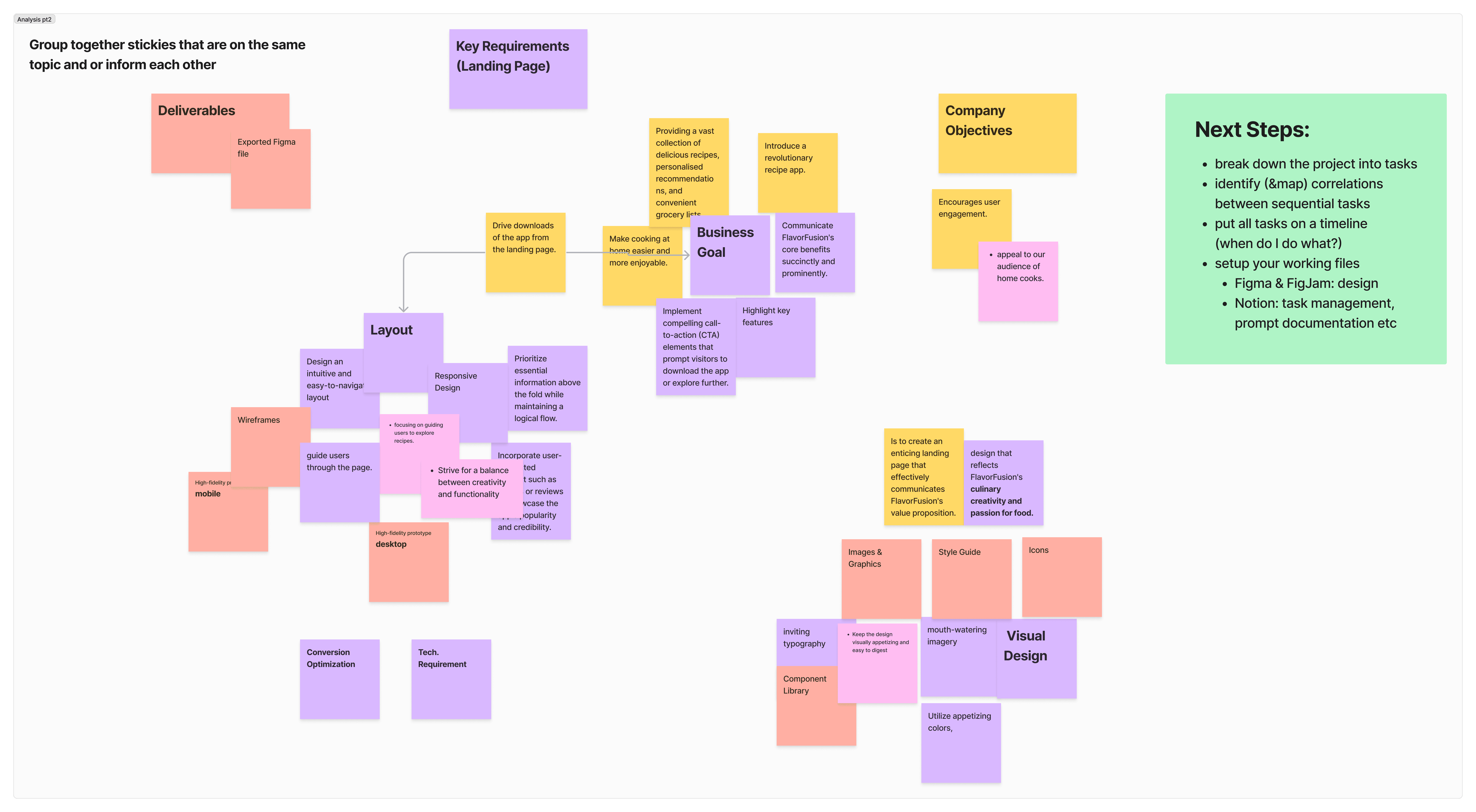
In this exercise, we incorporated AI from the very beginning, starting with the brief analysis. As a group, we created sticky notes highlighting the key features, requirements, and deliverables outlined in the brief. The AI then categorized these notes, offering us an alternative perspective on how to structure the information. This gave us a quick comparison to the clusters we had previously organized, allowing us to evaluate different approaches more efficiently.
Company Objectives:
Our company is excited to introduce a revolutionary recipe app, "FlavorFusion," to the market. FlavorFusion is designed to make cooking at home easier and more enjoyable by providing a vast collection of delicious recipes, personalized recommendations, and convenient grocery lists. Our goal is to create an enticing landing page that effectively communicates FlavorFusion's value proposition, encourages user engagement, and drives downloads.
Key Requirements:
Clear Value Proposition
Communicate FlavorFusion's core benefits succinctly and prominently.
Highlight key features that set FlavorFusion apart from other recipe apps.
Engaging Visual Design
Develop a visually appealing design that reflects FlavorFusion's culinary creativity and passion for food.
Utilize appetizing colors, mouth-watering imagery, and inviting typography to capture user attention.
User-Centric Layout
Design an intuitive and easy-to-navigate layout that guides users through the page.
Prioritize essential information above the fold while maintaining a logical flow.
Conversion Optimization
Implement compelling call-to-action (CTA) elements that prompt visitors to download the app or explore further.
Incorporate user-generated content such as photos or reviews to showcase the app's popularity and credibility.
Responsive Design
Brief Analysis:
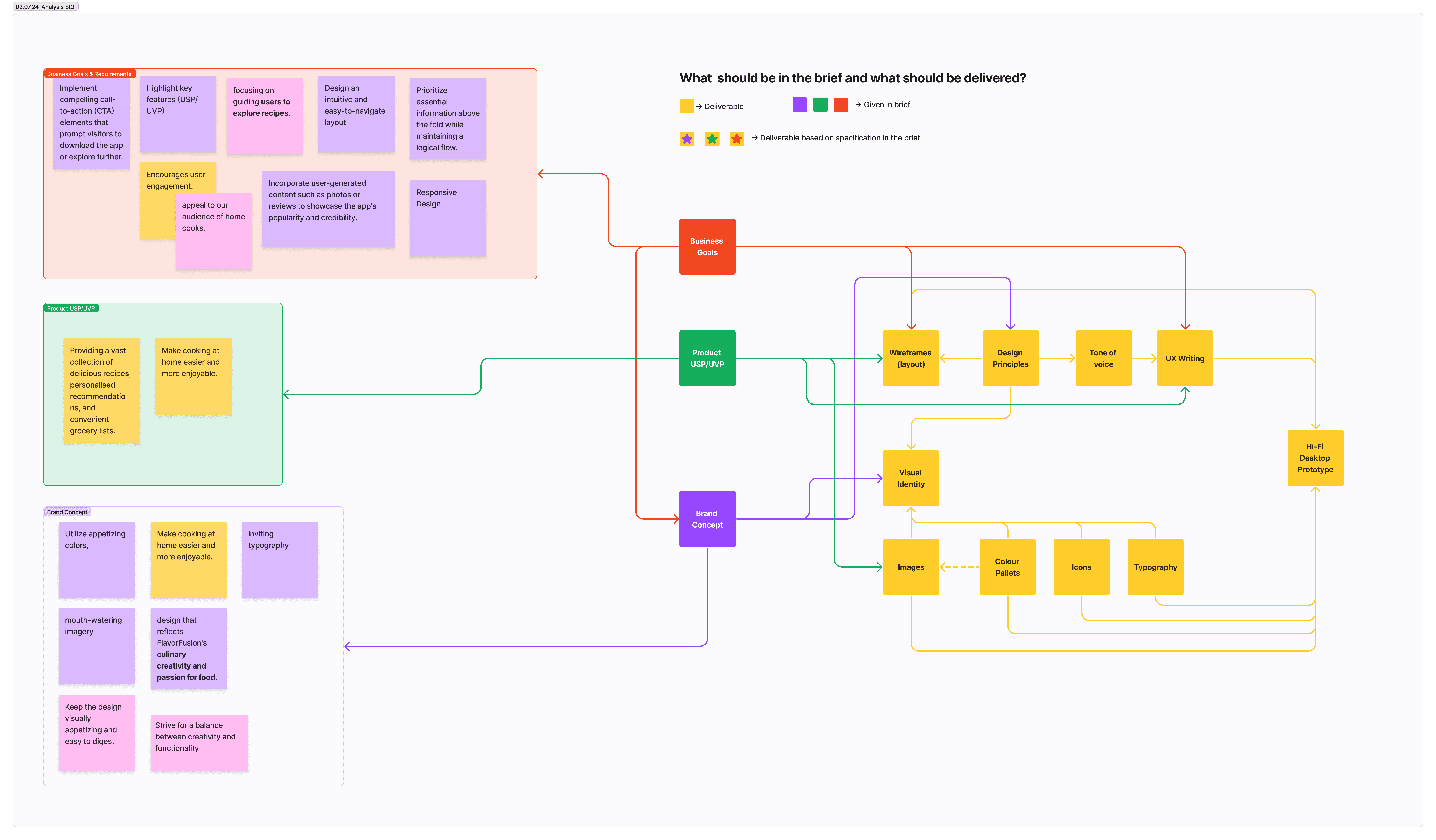
The brief analysis consisted of three steps in total:
Visualising key features and requirements
Grouping notes that are on the same topic or inform each other
mapping business goals, product uvs/usp, brand concept to corresponding deliverables
A parallel goal of this exercise was the use of AI in project management and organisation. I use Notion for the most part to manage my projects which is convenient, as it also has a built in AI. In this project I used it mainly for task management and prompt documentation.
I broke down the project into tasks and assigned the appropriate amounts of time. It did help to see the project laid out in front of me in a timeline.
Inspiration
I continued by gathering brand identity cues and inspiration for the design.
Based on my research on Dribble, I found that food related apps and websites often use a very rounded design with warm accent and decorative colors.
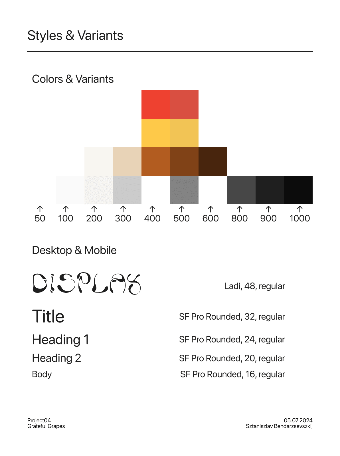
Based on the inspiration that I gathered I picked a color palette for my design.
Design
Lofi Wireframe
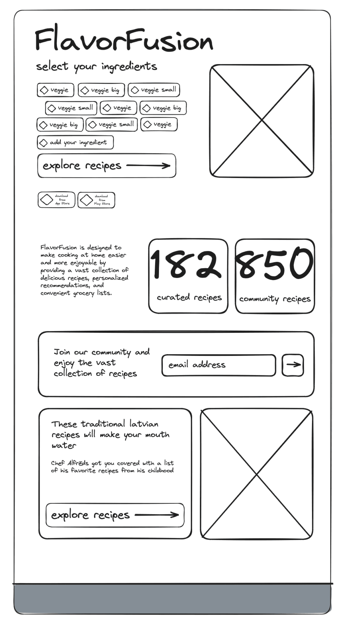
I sketched a lofi version of my landing page in Excalidraw.
Interactive Design
It became clear to me that interactive design was essential for drawing visitors in and sparking their interest. My initial concept was to create a dynamic tag cloud that would quickly recommend recipes based on ingredients users already have at home. This tag cloud was informed by brief research into the most commonly found ingredients in a typical European household. To enhance user interaction, I also added the option for users to input custom ingredients, offering a more personalized and engaging experience.
First Solution
I designed responsive elements that display brief descriptions and inspiring statistics about the app, with the goal of motivating visitors to click on the call-to-action (CTA). These dynamic elements adapt across different screen sizes, ensuring a seamless experience for both desktop and mobile users. The statistics, such as the number of recipes available or the personalized recommendations provided, were chosen to highlight FlavorFusion’s value and encourage deeper engagement.
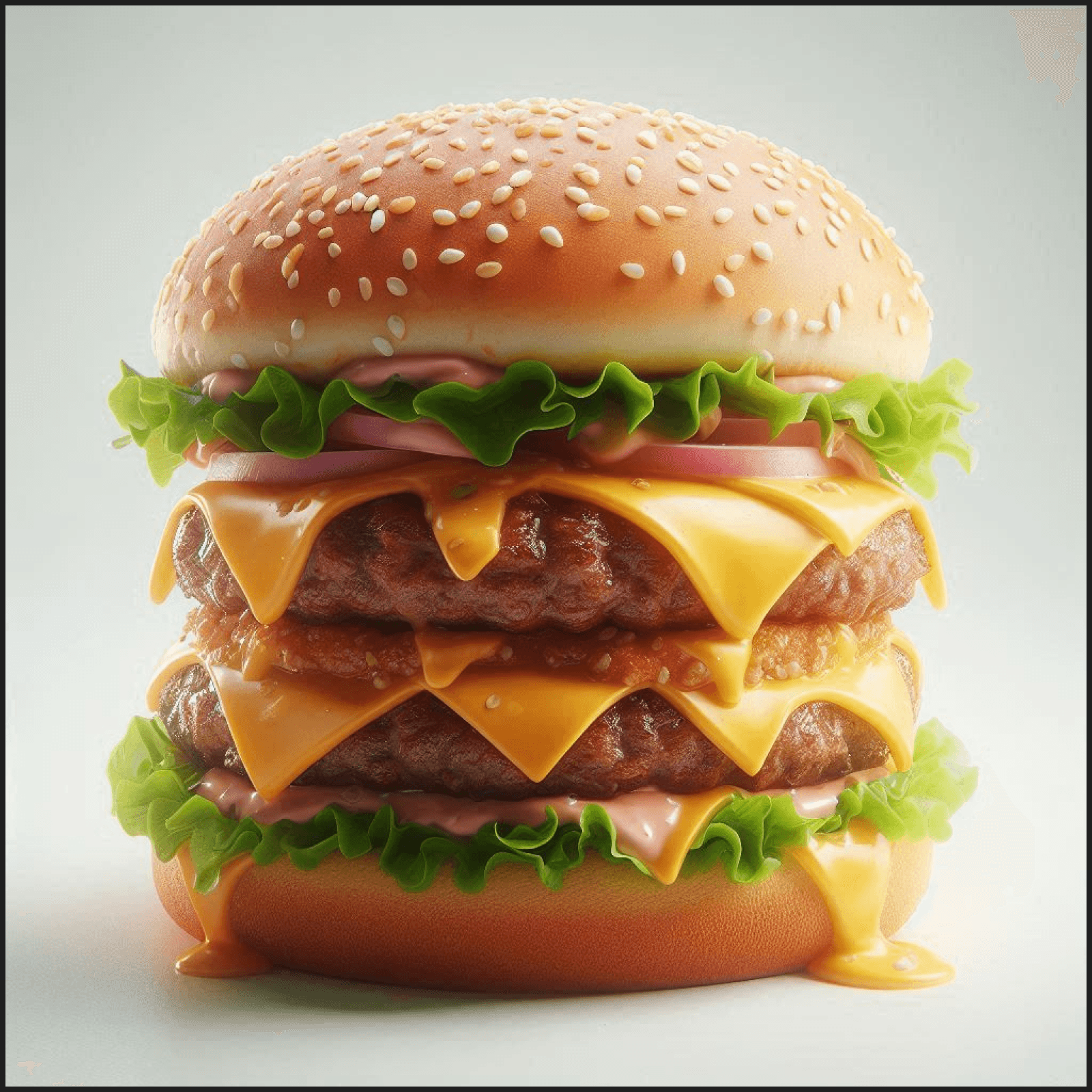
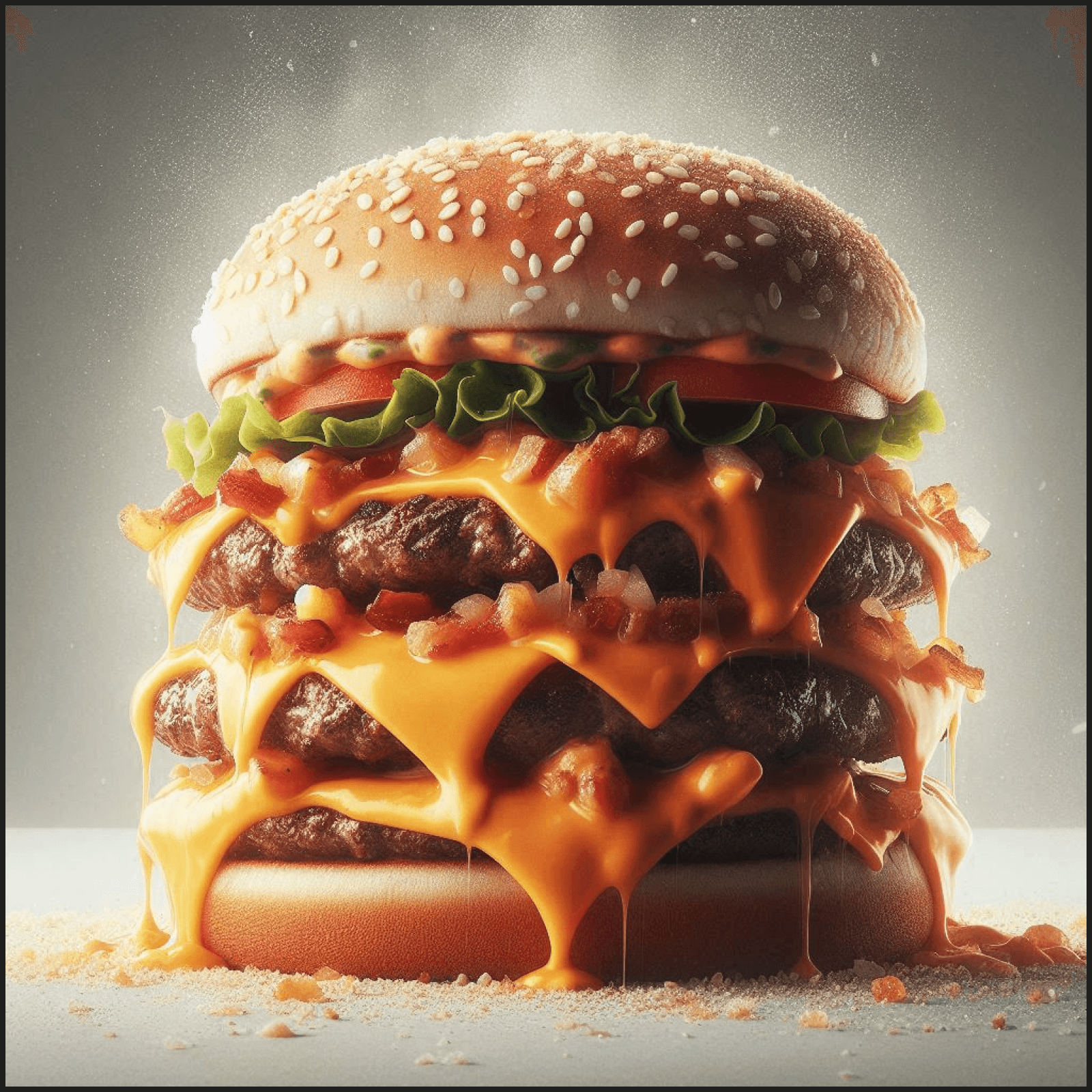
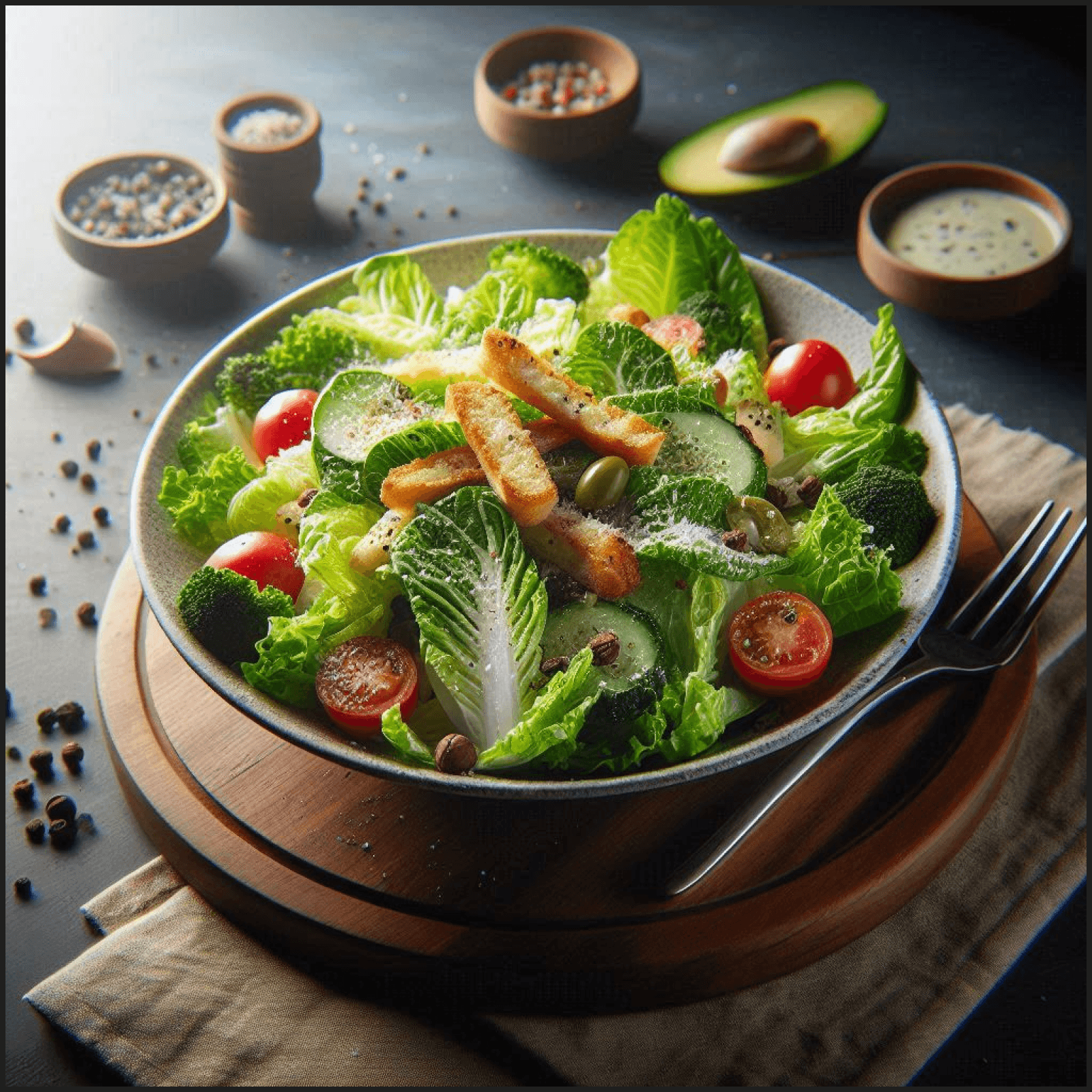
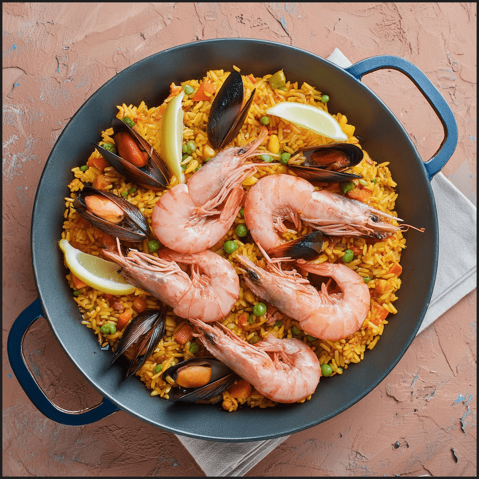
I used Adobe Firefly and ChatGPT’s DALL·E to generate images for the project. While some of the images retain a slightly dreamy quality, they are undeniably mouth-watering. Adobe Firefly produced more realistic-looking images, particularly when I needed photos of people, giving the visuals a more authentic and relatable feel.
Next, I added elements to strengthen the app’s credibility and popularity, such as content created by culinary professionals and curated recipe lists. These features were designed to showcase the expertise behind FlavorFusion and provide users with high-quality, trusted content. By highlighting professional contributions and carefully selected recipes, I aimed to build trust and increase user confidence in the app’s offerings.
I incorporated ‘appetizing colors’ into the design, enhancing the overall visual appeal and aligning with the theme of food. At this point, the assignment was nearing completion. I then focused on refining the details, such as implementing a dark mode for user comfort and adding interactive pop-ups to improve user experience and engagement.
Redesign / Leaving My Comfort Zone
After completing the assignment and drawing inspiration from related designs and competitors, I found myself feeling underwhelmed by the outcome. As I repeatedly examined my landing page, I became increasingly bored with its appearance. The feedback I received suggested that my design was merely ‘fine’ or ‘good,’ lacking any standout qualities. This prompted me to reflect on whether I would be genuinely impressed or inspired to use the product if I were a visitor to the landing page; ultimately, the answer was no. This realization led me to pivot my approach, reigniting my passion for the project. I began to create a concept that my cohort appreciated for its brevity, innovation, and clarity.
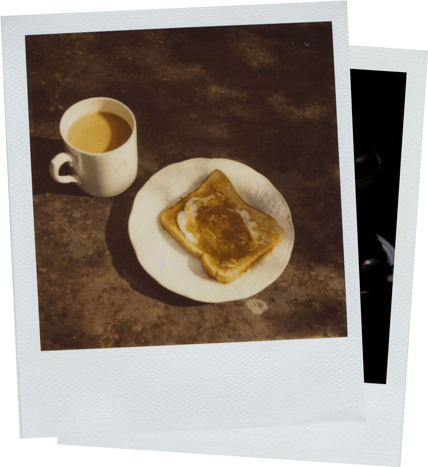
I envisioned my landing page as a platform that incorporates all the essential elements of a traditional landing page, yet looks and feels distinctly unique. My passion for finding inspiration in everyday objects and experiences guided my design process. I aimed for a clean, spacious, and beautiful aesthetic, prioritizing simplicity. Central to my concept was the desire to place a delicious meal at the forefront. In photography, this effect is often achieved by positioning the subject in the center of the frame, utilizing depth of field and strategic lighting to distinguish it from the background. I also considered using a square format, akin to a Polaroid, to add symmetry to the composition, enhancing the visual impact.
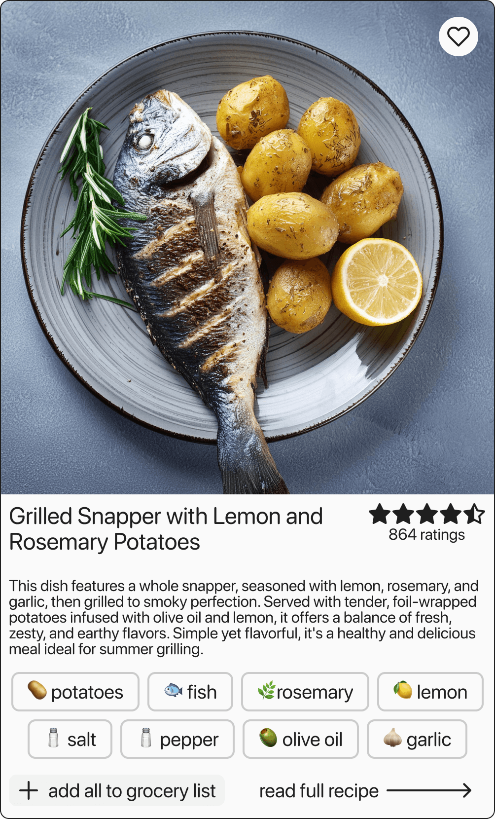
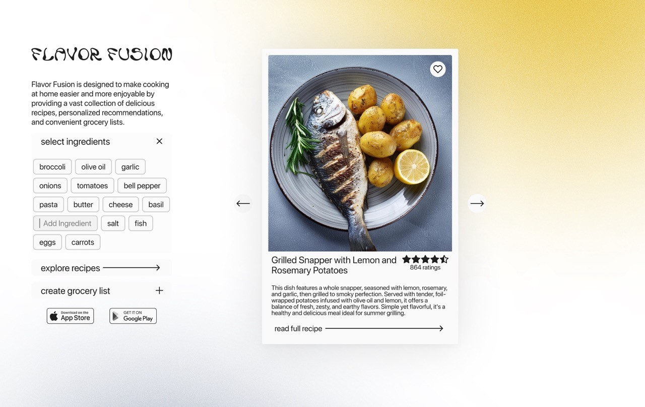
I found that Polaroids serve as a fantastic point of reference, functioning as cards that can be labeled and personalized with one’s fingerprints. This concept inspired my landing page design. I positioned a captivating image of a delicious meal at the center, with a title and description placed beneath it. The ratings act as the ‘fingerprints’ on these ‘Polaroids,’ providing insight into the app’s popularity and the appeal of its recipes. Additionally, I included a tag cloud that offers a quick overview of the ingredients, enhancing user engagement. A prominent ‘Add All to Grocery List’ button highlights a key feature of the app, while ‘Read Full Recipe’ serves as one of the two main calls to action (CTAs), directing users to the main website or app.
‘Next example’ takes the user to a different recipe.
On the left side below the logo is a brief introduction about the product.
‘Select Ingredients’ opens a toggle containing the original tag cloud used for filtering recipes based on selected ingredients. ‘Find Recipe’ is one of the two main CTA’s that takes the user to the main site or app. ‘Add to grocery list’ shows the organisation tool offered by the app. Below are links to the App Store and Google Play store.
This design allows for a unique experience without scrolling on a desktop.
Iteration
After delivering my presentation, I received valuable feedback that prompted several adjustments to my design. This input allowed me to identify areas for improvement and refine my approach, ultimately enhancing the overall effectiveness of the landing page.
Side Panel
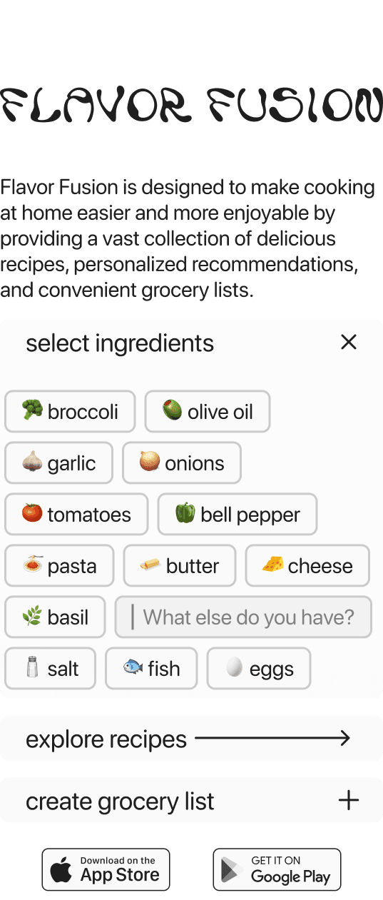
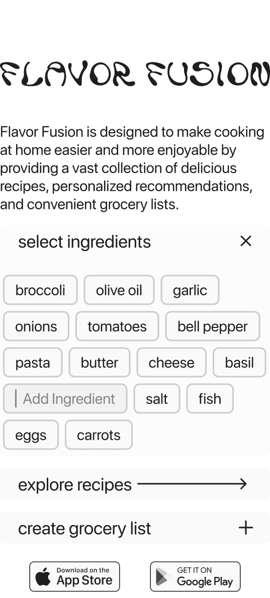
I changed the copy from 'What else do you have?' to 'add ingredients' for more clarity.
I removed the emojis from the design and added a stroke to the tags to simplify their appearance and improve contrast. This change not only streamlined the overall aesthetic but also made the tags more legible and visually distinct, ensuring they effectively capture user attention.
I recognized that the ‘grocery list’ toggle required clarification, so I enhanced the copy by renaming it to ‘Create Grocery List’ and transformed it into a button. This adjustment clarifies the action for users and positions it as a call to action (CTA), encouraging more engagement with this key feature.
Recipe Card
Based on the feedback I received, it was noted that my card design did not effectively resemble a Polaroid and appeared too busy overall. This insight highlighted the need for further simplification and adjustments to better capture the intended aesthetic while enhancing clarity.
To improve the design, I added borders to the card, which created a more spacious feel. I removed the tag cloud and the ‘Add to Grocery List’ button to declutter the layout. Additionally, I increased the size of the call to action (CTA) to enhance its prominence and draw more attention.
The text on the ‘next’ button was unnecessary so I removed that and added a background to the arrow, improving its visibility.
I added an additional navigation button to improve usability and functionality.
I removed the light/dark mode switch to further declutter the landing page






























-
↓
↓
↓
-
↓
↓
↓
-


Flavor Fusion
Spiced Academy
UX UI Design Course
Roles
UX/UI Design, Graphic Design, Art Direction, Prompt engineering
Roles
UX/UI Design, Graphic Design, Art Direction, Prompt engineering
FlavorFusion emerged from one of my UX/UI course projects, where the goal was to design a landing page for a recipe search app or website. A key requirement was to integrate AI tools throughout the design process to streamline each stage, enabling the creation of a high-fidelity prototype more efficiently. This approach minimized the use of placeholder content like dummy text or stock images, enhancing the authenticity and polish of the final design.
Brief
In this exercise, we incorporated AI from the very beginning, starting with the brief analysis. As a group, we created sticky notes highlighting the key features, requirements, and deliverables outlined in the brief. The AI then categorized these notes, offering us an alternative perspective on how to structure the information. This gave us a quick comparison to the clusters we had previously organized, allowing us to evaluate different approaches more efficiently.
Company Objectives:
Our company is excited to introduce a revolutionary recipe app, "FlavorFusion," to the market. FlavorFusion is designed to make cooking at home easier and more enjoyable by providing a vast collection of delicious recipes, personalized recommendations, and convenient grocery lists. Our goal is to create an enticing landing page that effectively communicates FlavorFusion's value proposition, encourages user engagement, and drives downloads.
Key Requirements:
Clear Value Proposition
Communicate FlavorFusion's core benefits succinctly and prominently.
Highlight key features that set FlavorFusion apart from other recipe apps.
Engaging Visual Design
Develop a visually appealing design that reflects FlavorFusion's culinary creativity and passion for food.
Utilize appetizing colors, mouth-watering imagery, and inviting typography to capture user attention.
User-Centric Layout
Design an intuitive and easy-to-navigate layout that guides users through the page.
Prioritize essential information above the fold while maintaining a logical flow.
Conversion Optimization
Implement compelling call-to-action (CTA) elements that prompt visitors to download the app or explore further.
Incorporate user-generated content such as photos or reviews to showcase the app's popularity and credibility.
Responsive Design
Brief Analysis:
The brief analysis consisted of three steps in total:
Visualising key features and requirements
Grouping notes that are on the same topic or inform each other
mapping business goals, product uvs/usp, brand concept to corresponding deliverables
A parallel goal of this exercise was the use of AI in project management and organisation. I use Notion for the most part to manage my projects which is convenient, as it also has a built in AI. In this project I used it mainly for task management and prompt documentation.
I broke down the project into tasks and assigned the appropriate amounts of time. It did help to see the project laid out in front of me in a timeline.


Inspiration
I continued by gathering brand identity cues and inspiration for the design.
Based on my research on Dribble, I found that food related apps and websites often use a very rounded design with warm accent and decorative colors.
Based on the inspiration that I gathered I picked a color palette for my design.


Design
Lofi Wireframe
I sketched a lofi version of my landing page in Excalidraw.
Interactive Design
It became clear to me that interactive design was essential for drawing visitors in and sparking their interest. My initial concept was to create a dynamic tag cloud that would quickly recommend recipes based on ingredients users already have at home. This tag cloud was informed by brief research into the most commonly found ingredients in a typical European household. To enhance user interaction, I also added the option for users to input custom ingredients, offering a more personalized and engaging experience.


First Solution
I designed responsive elements that display brief descriptions and inspiring statistics about the app, with the goal of motivating visitors to click on the call-to-action (CTA). These dynamic elements adapt across different screen sizes, ensuring a seamless experience for both desktop and mobile users. The statistics, such as the number of recipes available or the personalized recommendations provided, were chosen to highlight FlavorFusion’s value and encourage deeper engagement.
I used Adobe Firefly and ChatGPT’s DALL·E to generate images for the project. While some of the images retain a slightly dreamy quality, they are undeniably mouth-watering. Adobe Firefly produced more realistic-looking images, particularly when I needed photos of people, giving the visuals a more authentic and relatable feel.
Next, I added elements to strengthen the app’s credibility and popularity, such as content created by culinary professionals and curated recipe lists. These features were designed to showcase the expertise behind FlavorFusion and provide users with high-quality, trusted content. By highlighting professional contributions and carefully selected recipes, I aimed to build trust and increase user confidence in the app’s offerings.
I incorporated ‘appetizing colors’ into the design, enhancing the overall visual appeal and aligning with the theme of food. At this point, the assignment was nearing completion. I then focused on refining the details, such as implementing a dark mode for user comfort and adding interactive pop-ups to improve user experience and engagement.


Redesign / Leaving My Comfort Zone
After completing the assignment and drawing inspiration from related designs and competitors, I found myself feeling underwhelmed by the outcome. As I repeatedly examined my landing page, I became increasingly bored with its appearance. The feedback I received suggested that my design was merely ‘fine’ or ‘good,’ lacking any standout qualities. This prompted me to reflect on whether I would be genuinely impressed or inspired to use the product if I were a visitor to the landing page; ultimately, the answer was no. This realization led me to pivot my approach, reigniting my passion for the project. I began to create a concept that my cohort appreciated for its brevity, innovation, and clarity.
I envisioned my landing page as a platform that incorporates all the essential elements of a traditional landing page, yet looks and feels distinctly unique. My passion for finding inspiration in everyday objects and experiences guided my design process. I aimed for a clean, spacious, and beautiful aesthetic, prioritizing simplicity. Central to my concept was the desire to place a delicious meal at the forefront. In photography, this effect is often achieved by positioning the subject in the center of the frame, utilizing depth of field and strategic lighting to distinguish it from the background. I also considered using a square format, akin to a Polaroid, to add symmetry to the composition, enhancing the visual impact.
I found that Polaroids serve as a fantastic point of reference, functioning as cards that can be labeled and personalized with one’s fingerprints. This concept inspired my landing page design. I positioned a captivating image of a delicious meal at the center, with a title and description placed beneath it. The ratings act as the ‘fingerprints’ on these ‘Polaroids,’ providing insight into the app’s popularity and the appeal of its recipes. Additionally, I included a tag cloud that offers a quick overview of the ingredients, enhancing user engagement. A prominent ‘Add All to Grocery List’ button highlights a key feature of the app, while ‘Read Full Recipe’ serves as one of the two main calls to action (CTAs), directing users to the main website or app.


‘Next example’ takes the user to a different recipe.
On the left side below the logo is a brief introduction about the product.
‘Select Ingredients’ opens a toggle containing the original tag cloud used for filtering recipes based on selected ingredients. ‘Find Recipe’ is one of the two main CTA’s that takes the user to the main site or app. ‘Add to grocery list’ shows the organisation tool offered by the app. Below are links to the App Store and Google Play store.
This design allows for a unique experience without scrolling on a desktop.


Iteration
After delivering my presentation, I received valuable feedback that prompted several adjustments to my design. This input allowed me to identify areas for improvement and refine my approach, ultimately enhancing the overall effectiveness of the landing page.


Side Panel
I changed the copy from 'What else do you have?' to 'add ingredients' for more clarity.
I removed the emojis from the design and added a stroke to the tags to simplify their appearance and improve contrast. This change not only streamlined the overall aesthetic but also made the tags more legible and visually distinct, ensuring they effectively capture user attention.
I recognized that the ‘grocery list’ toggle required clarification, so I enhanced the copy by renaming it to ‘Create Grocery List’ and transformed it into a button. This adjustment clarifies the action for users and positions it as a call to action (CTA), encouraging more engagement with this key feature.
Recipe Card
Based on the feedback I received, it was noted that my card design did not effectively resemble a Polaroid and appeared too busy overall. This insight highlighted the need for further simplification and adjustments to better capture the intended aesthetic while enhancing clarity.
To improve the design, I added borders to the card, which created a more spacious feel. I removed the tag cloud and the ‘Add to Grocery List’ button to declutter the layout. Additionally, I increased the size of the call to action (CTA) to enhance its prominence and draw more attention.
The text on the ‘next’ button was unnecessary so I removed that and added a background to the arrow, improving its visibility.
I added an additional navigation button to improve usability and functionality.
I removed the light/dark mode switch to further declutter the landing page